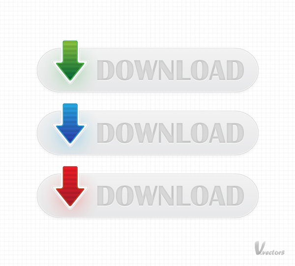
Final Product What You'll Be Creating
In the following tutorial you will learn how to create a
clean download button in Adobe Illustrator. By first using the
Rectangle Tool and some simple effects you will create the overall
button shape. Next, using some other basic tools and effect along with
some nice colors and patterns you will create the arrow shape. Finally,
for the text you will use a bold font along with some simple effects.
Step 1
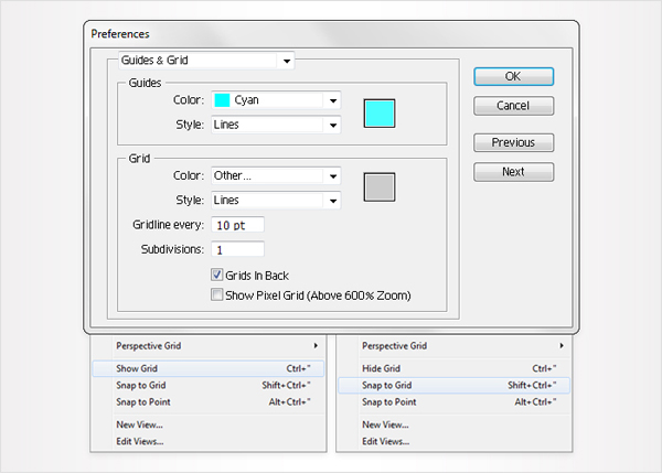
Create a 700 by 240, RGB document. First, turn on the Grid (View
> Grid) and the Snap to Grid (View > Snap to Grid). Next, you’ll
need a grid every 10px. Go to Edit > Preferences > Guides &
Grid, enter 10 in the Gridline every box and 1 in the Subdivisions box.
You should also open the Info panel (Window > Info) for a live
preview with the size and position of your shapes. Do not forget to
replace the unit of measurement to pixels from Edit > Preferences
> Unit > General. All these options will significantly increase
your work speed.
Step 2
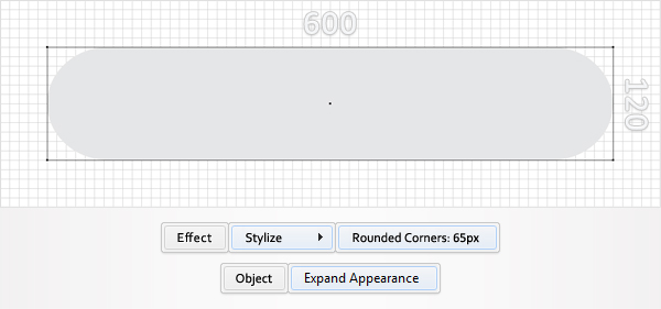
Let’s start with the Rectangle Tool (M). Create a 600 by 120px
shape, fill it with any color then go to Effect > Stylize >
Rounded Corners. Enter a 65px radius, click OK then go to Object >
Expand Appearance.
Step 3
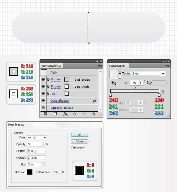
Select the shape made in the previous step, replace the fill color
with the linear gradient shown below then add a white stroke. Make it
2pt wide and align it to inside then open the fly-out menu of the
Appearance panel and click on Add New Stroke. This will add a second
stroke for your shape. Make it 1pt wide, align it to inside and set the
color at R=210 G=210 B=210. Finally, reselect the entire path and go to
Effect > Stylize > Drop Shadow. Enter the data shown in the
following image then click OK.
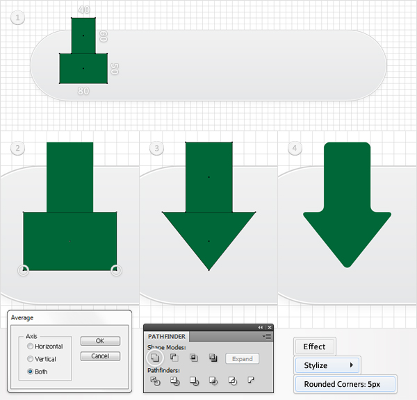
Step 4
Pick the Rectangle Tool (M), create two new shape and place them as
shown in the first image. The Snap to Grid will ease your work. Grab
the Direct Selection Tool (A) and focus on the bottom shape. Select the
anchor points highlighted in the second image and go to Object >
Path > Average. Check both then click OK. The resulting shape should
look like a triangle. Select it along with the other rectangle and
click on the Unite button from the Pathfinder panel. The resulting
shape should look like a simple arrow. Select it and go to Effect >
Stylize > Rounded Corners, enter a 5px radius then click OK.
Step 5
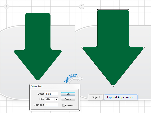
Select the arrow shape and go to Object > Path > Offset Path.
Enter a 5px Offset and click OK. Select the resulting shape and go to
Object > Expand Appearance.
Step 6
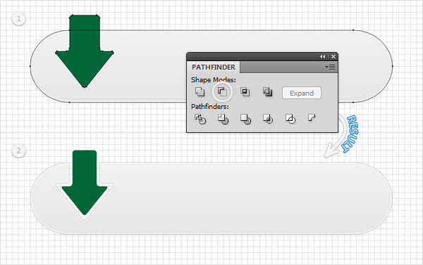
Select the shape made in the previous step along with the rounded
rectangle and click on the Minus Front button from the Pathfinder
panel. Now, your shape should look like in the second image.
Step 7
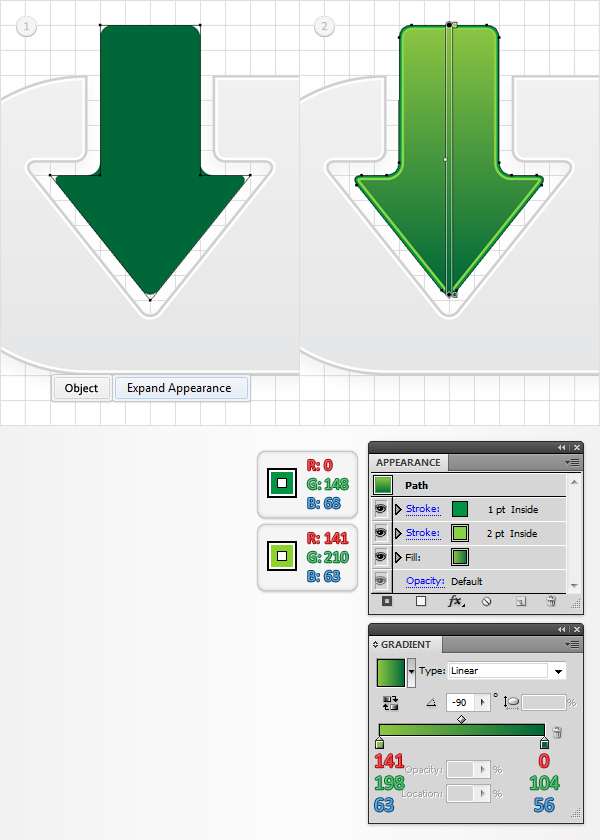
Select the remaining arrow shape and go to Object > Expand
Appearance. Fill the resulting shape with the linear gradient shown
below then add a first stroke. Make it 2pt wide, align it to inside and
set its color at R=141 G=210 B=63. Next, add a second stroke for this
arrow shape. Make it 1pt wide, align it to inside and set its color at
R=0 G=148 B=68.
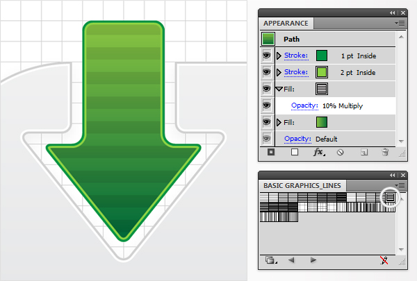
Step 8
Open the fly-out menu of the Swatches panel and go to Open Swatch
Library > Pattern > Basic Graphics > Basic Graphics_Lines.
This will open a panel with a set of nice pattern. Select the arrow
shape, open the fly-out menu of the Appearance panel and click on Add
New Fill. Obviously, this will add a second fill for your shape. Select
it from the Appearance panel, lower its opacity to 10%, change the
blending mode to Multiply then use the 6 lpi 50% pattern. In the end
your arrow should look like in the following image.
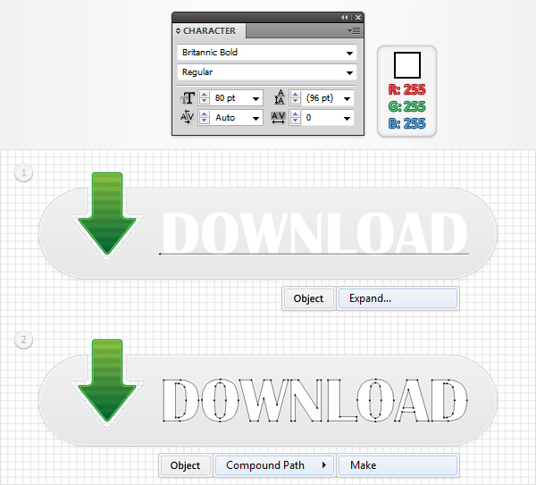
Step 9
Pick the Type Tool (T), click on your artboard and add your text.
Use the Britannic Bold font with a size of 80pt then go to Object >
Expand. Select the resulting shapes and go to Object > Compound Path
> Make.
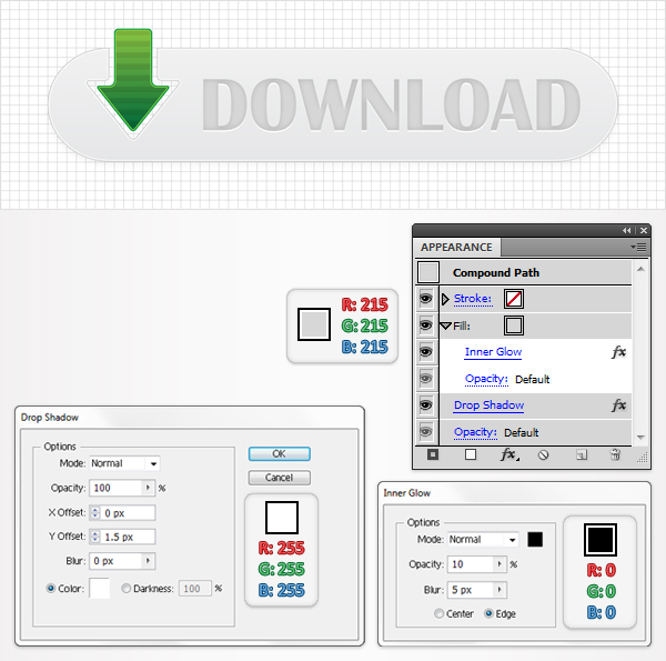
Step 10
Select the path made in the previous step, fill it with R=215 G=215
B=215 then go to the Appearance panel. Select the fill and go to Effect
> Stylize > Inner Glow. Enter the data shown below, click OK then
go to Effect > Stylize > Drop Shadow. Enter the data shown in the
following image then click OK.
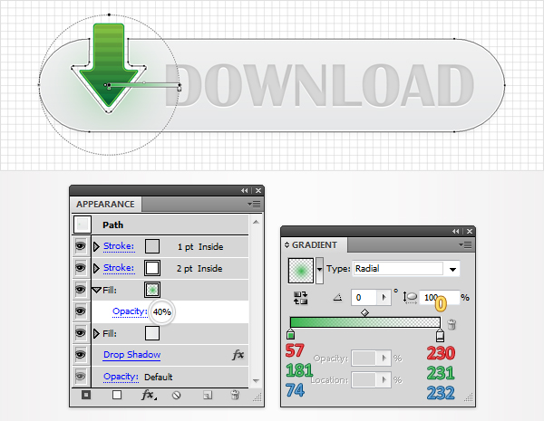
Step 11
Finally, reselect the shape made in the sixth step and add a second
fill. Select it from the Appearance panel, lower its opacity to 40%
then use the radial gradient shown in the following image. The yellow
zero from the gradient image stands for opacity percentage.
Conclusion
Now your work is done. This is what it should look like. Replace the
green shades with other colors as shown in the following image. Also,
you can try a different pattern for the arrow or you can change the
colors used for the button and the text. Enjoy!

No comments:
Post a Comment